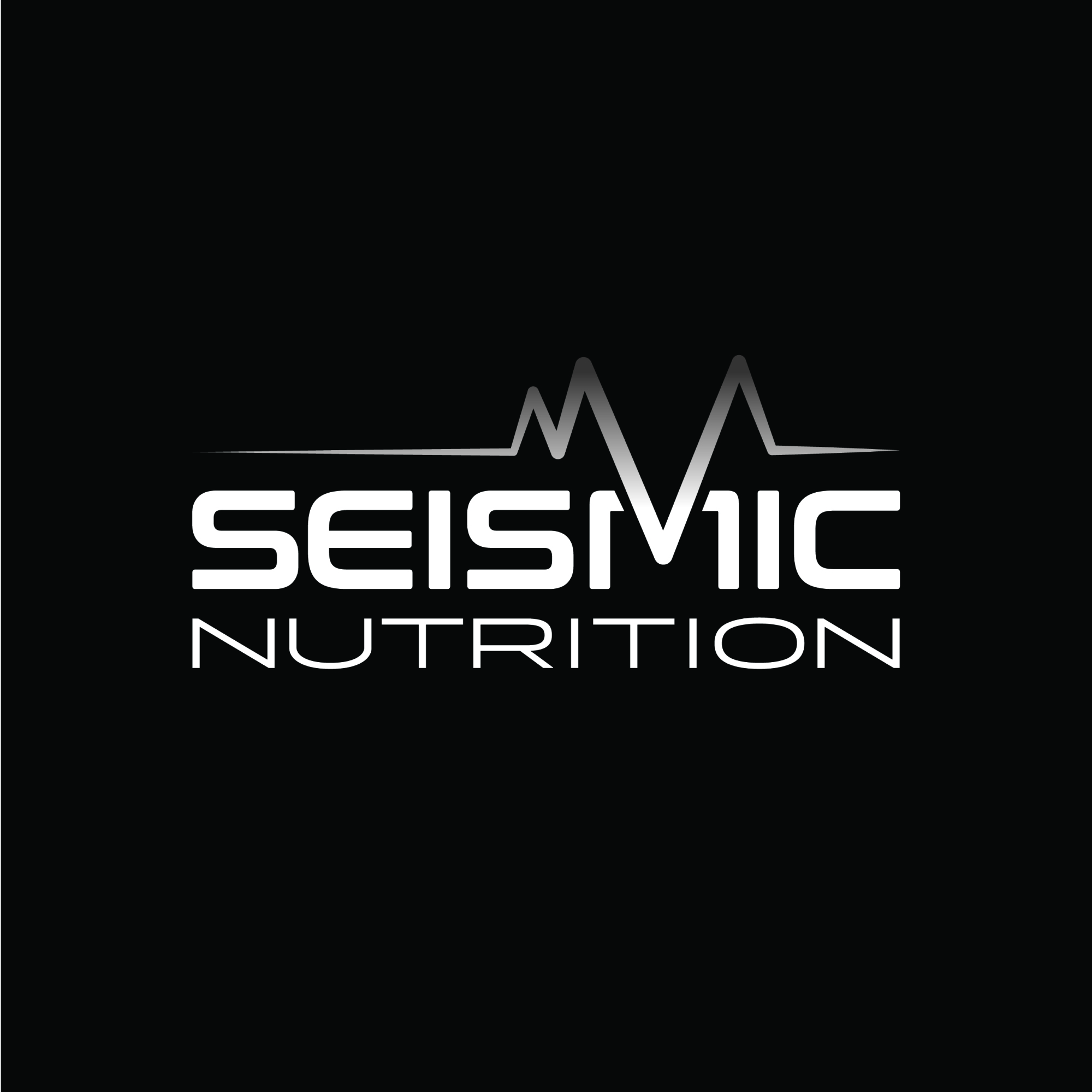
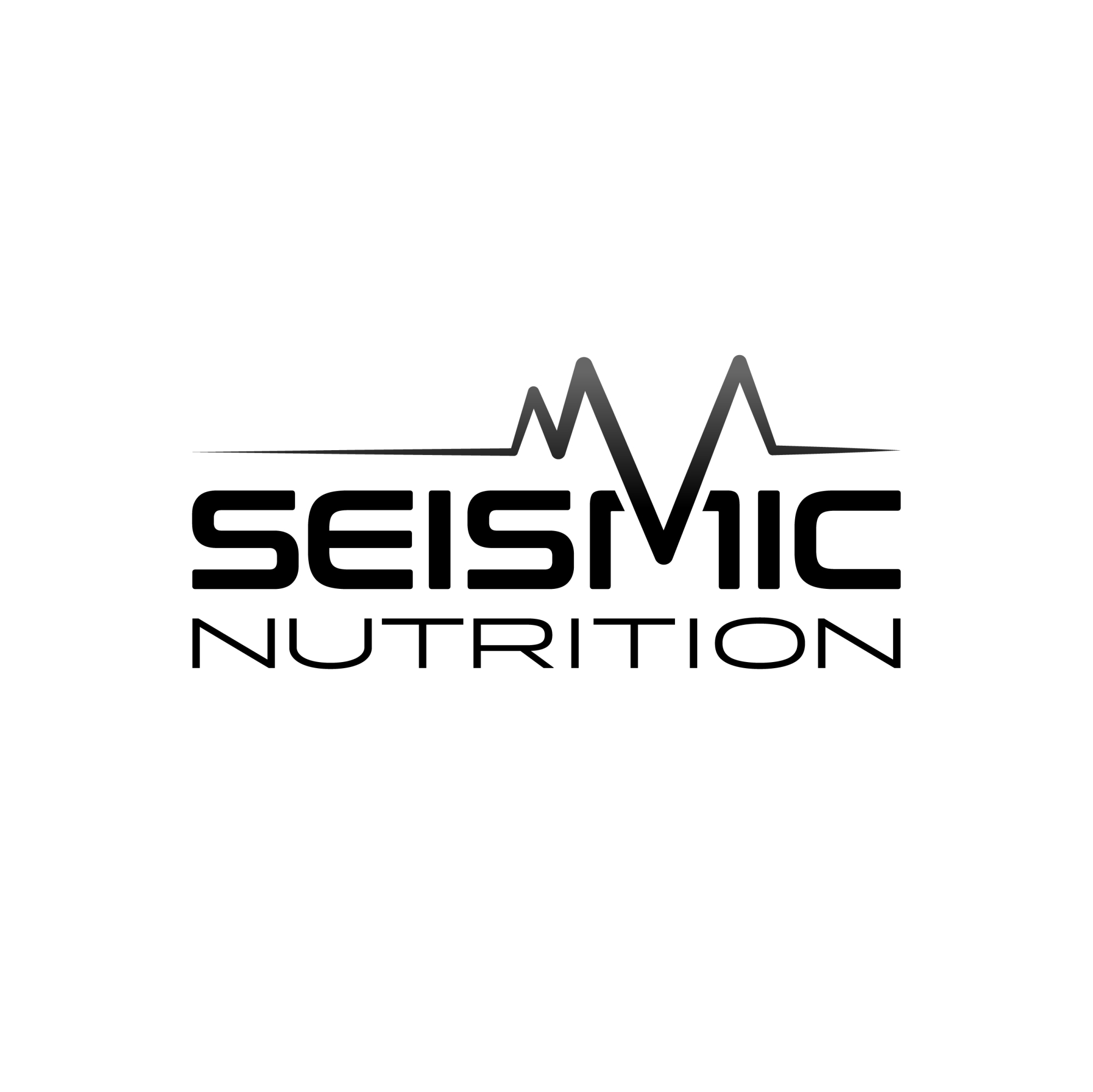
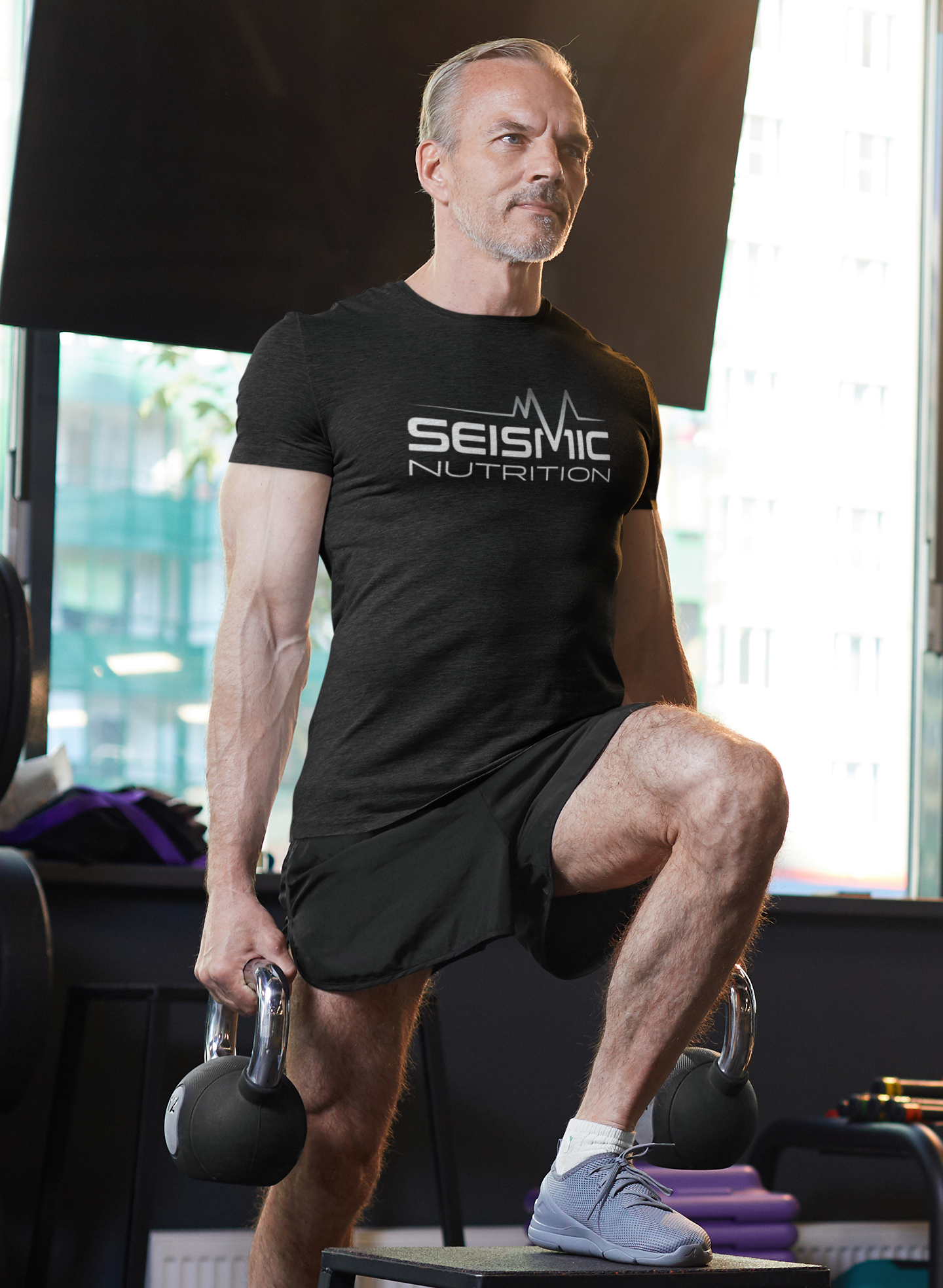
Seismic Nutrition
Branding for a new Indiana-based nutrition company. The client wanted a clean, high contrast logo with a visual reference to earthquakes. Playing off the vertical movement of seismic waves, the lines d rop down to create the "M" with a subtle gradient.